Alcon - Adi Planner
Alcon is a global leader in eye care. With decades of experience, Alcon provides surgical, vision care, and ophthalmic products. Serving healthcare professionals and patients worldwide, Alcon focuses on improving vision quality.
Alcon is a global leader in eye care. With decades of experience, Alcon provides surgical, vision care, and ophthalmic products. Serving healthcare professionals and patients worldwide, Alcon focuses on improving vision quality.
COMPANY
COMPANY
Alcon
Alcon
DURATION
DURATION
1 Year (2024-2025)
1 Year (2024-2025)
ROLE
ROLE
Senior Product Designer
Senior Product Designer
PLATFORM
PLATFORM
Web Application
Web Application
FOCUS
FOCUS
0→1, Data Viz, Al
0→1, Data Viz, Al
Design Systems
Rapid Prototyping
AI
User Research
Responsive Web
Overview
Surgeons and clinic staff were struggling with seven fragmented tools, leading to inefficiencies and delays. Through user interviews, I uncovered their pain points and envisioned a unified platform. I designed wireframes and prototypes in Figma, collaborating with cross-functional teams to validate solutions through A/B testing.
Surgeons and clinic staff were struggling with seven fragmented tools, leading to inefficiencies and delays. Through user interviews, I uncovered their pain points and envisioned a unified platform. I designed wireframes and prototypes in Figma, collaborating with cross-functional teams to validate solutions through A/B testing.

Design Challenge
No visibility. No control. No playbook.
No visibility. No control. No playbook.
Through stakeholder interviews and field research, I mapped out the core pain points facing construction site managers during the electrification transition.
Through stakeholder interviews and field research, I mapped out the core pain points facing construction site managers during the electrification transition.
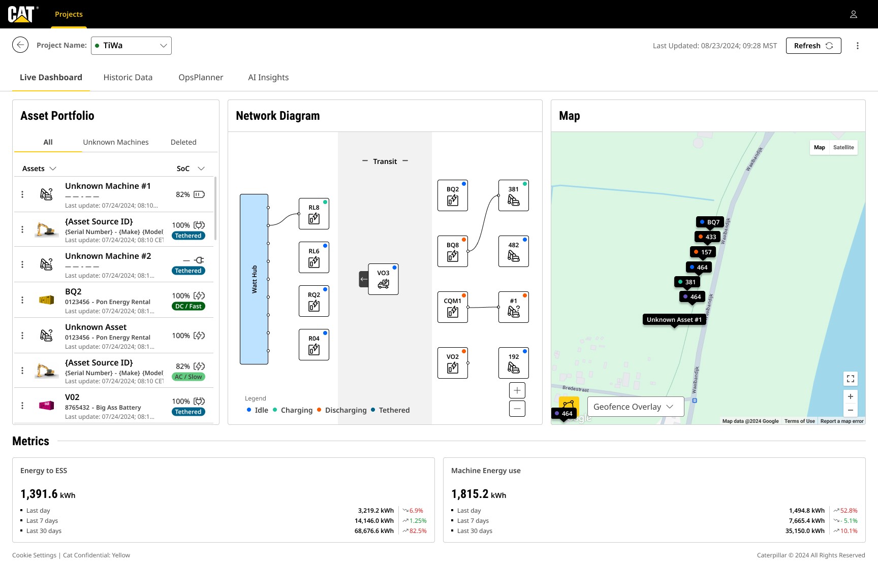
Fragmented Tools and Workflows
Fragmented Tools and Workflows
Integrating seven disparate tools into a single cohesive platform while maintaining seamless functionality and consistency across workflows was a critical challenge.
Integrating seven disparate tools into a single cohesive platform while maintaining seamless functionality and consistency across workflows was a critical challenge.
Simplifying Complex Data
Simplifying Complex Data
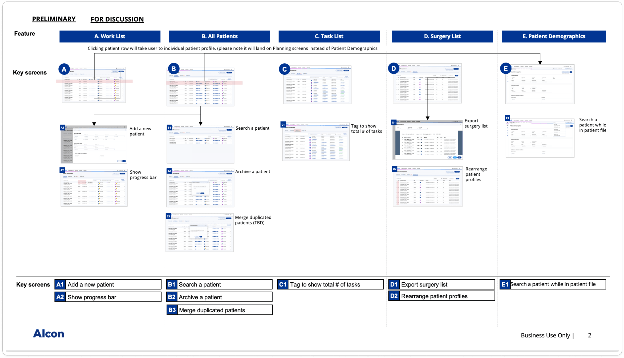
Presenting detailed patient and surgery information in an intuitive, accessible way for surgeons and staff, without overwhelming users or sacrificing accuracy.
Presenting detailed patient and surgery information in an intuitive, accessible way for surgeons and staff, without overwhelming users or sacrificing accuracy.
Ensuring Scalability and Usability
Ensuring Scalability and Usability
Developing a scalable design system that not only unified the platform but also supported future integrations, while meeting the diverse needs of both technical and non-technical users.
Developing a scalable design system that not only unified the platform but also supported future integrations, while meeting the diverse needs of both technical and non-technical users.
Ensuring Scalability and Usability
Ensuring Scalability and Usability
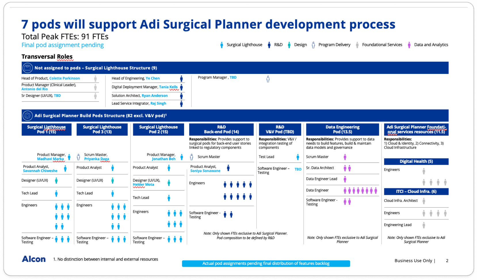
Aligning with product managers, engineers, and R&D teams to balance technical feasibility, business goals, and user needs while delivering the product within tight deadlines.
Aligning with product managers, engineers, and R&D teams to balance technical feasibility, business goals, and user needs while delivering the product within tight deadlines.

Research: Building Adi-Planner with Real Insights
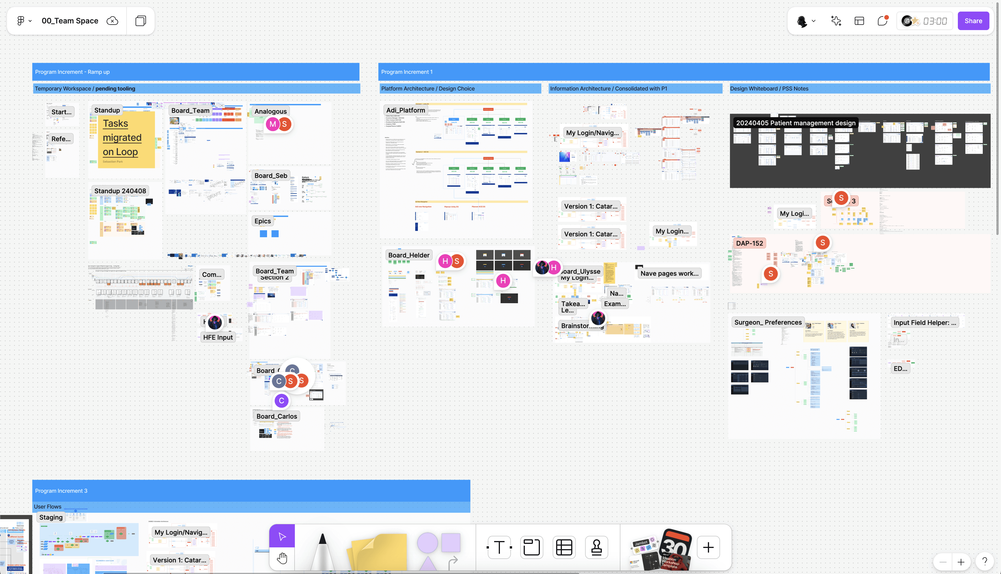
To understand the challenges faced by surgeons and clinic staff, I conducted in-depth user interviews and analyzed workflows across the seven existing tools. This research uncovered key pain points, including fragmented data access, inconsistent interfaces, and time-consuming task-switching.I also collaborated with stakeholders, including surgeons, administrators, and R&D teams, to map out user journeys and identify critical touchpoints. Competitive analysis of similar healthcare platforms provided additional insights into best practices for data organization and workflow optimization.These findings formed the foundation for a user-centered design approach, ensuring the new platform addressed real-world needs while simplifying complex processes.
To understand the challenges faced by surgeons and clinic staff, I conducted in-depth user interviews and analyzed workflows across the seven existing tools. This research uncovered key pain points, including fragmented data access, inconsistent interfaces, and time-consuming task-switching.I also collaborated with stakeholders, including surgeons, administrators, and R&D teams, to map out user journeys and identify critical touchpoints. Competitive analysis of similar healthcare platforms provided additional insights into best practices for data organization and workflow optimization.These findings formed the foundation for a user-centered design approach, ensuring the new platform addressed real-world needs while simplifying complex processes.

E.Ideation and Brainstorming
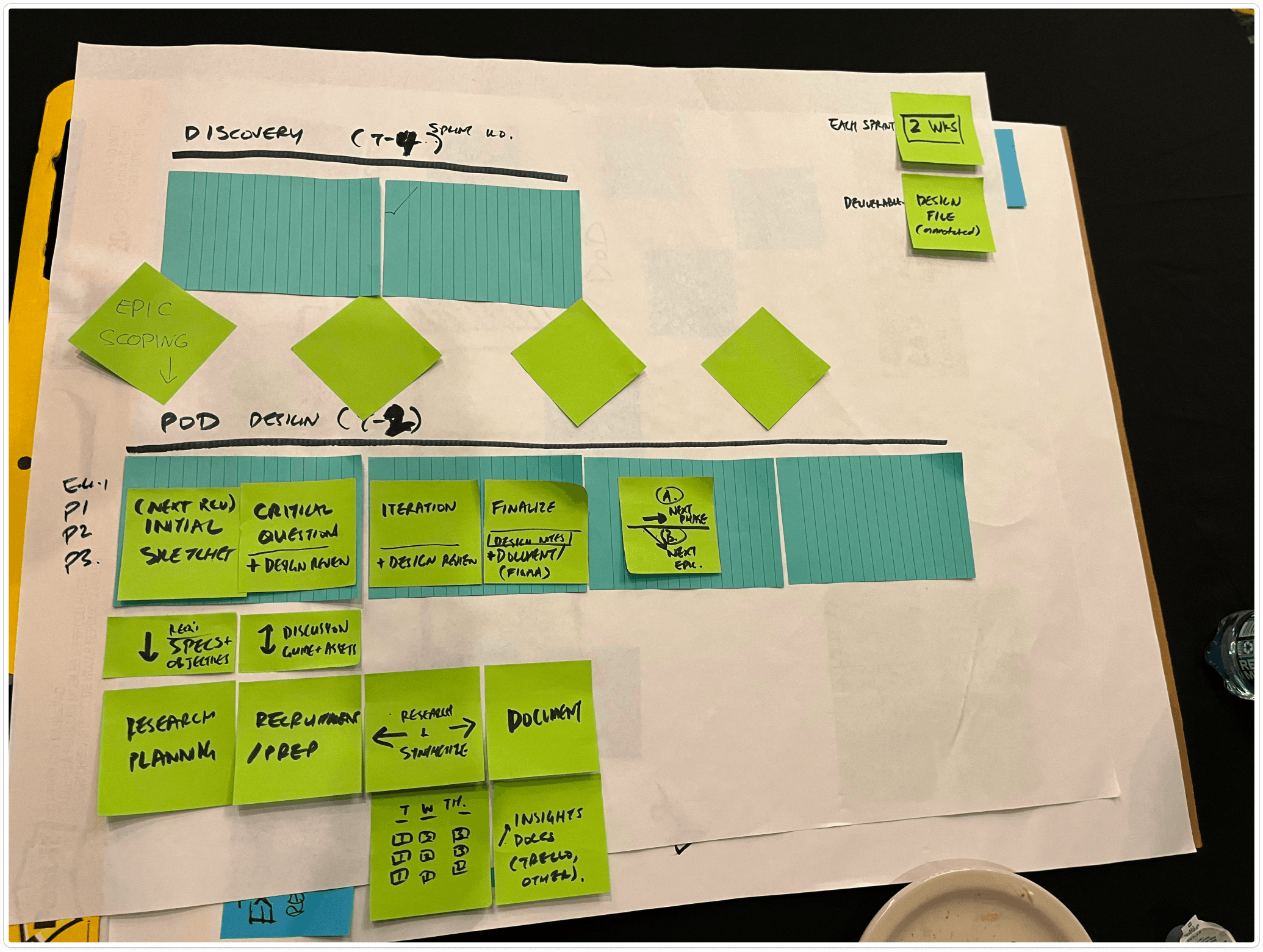
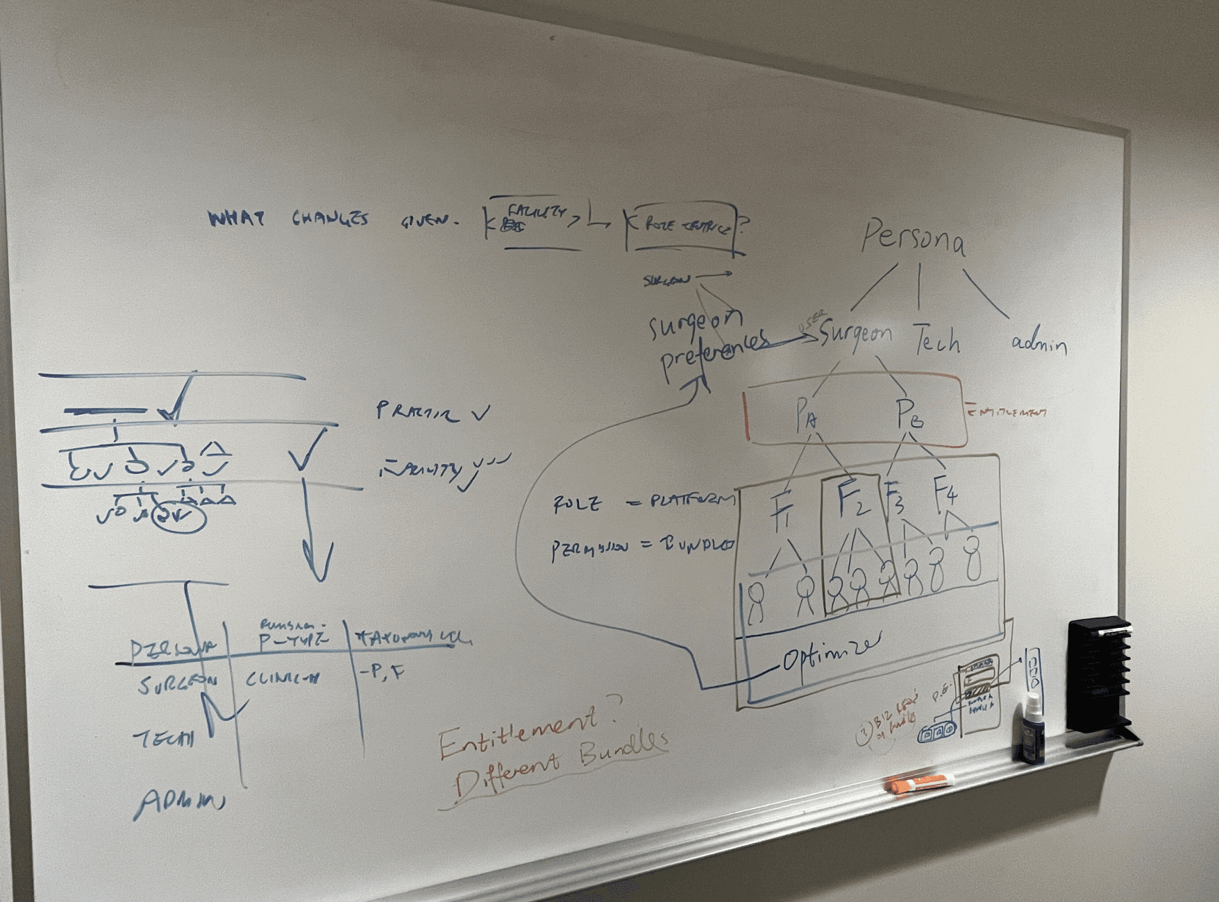
Using research insights, I sketched wireframes to streamline workflows and prioritize key tasks, focusing on unifying seven tools into one platform. Collaborating with cross-functional teams, we refined these concepts through brainstorming and feedback sessions. Prototypes in Figma were developed and tested via A/B testing, ensuring the solution met user needs and aligned with technical and business goals.
Using research insights, I sketched wireframes to streamline workflows and prioritize key tasks, focusing on unifying seven tools into one platform. Collaborating with cross-functional teams, we refined these concepts through brainstorming and feedback sessions. Prototypes in Figma were developed and tested via A/B testing, ensuring the solution met user needs and aligned with technical and business goals.
Design System
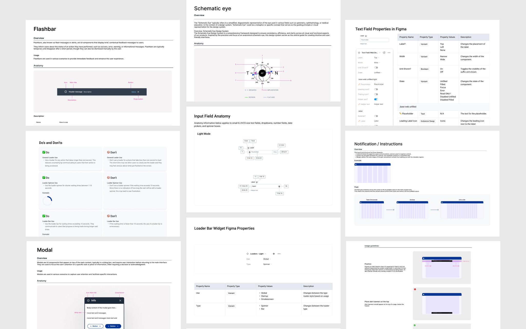
I developed a scalable design system to unify the platform’s visual and interaction patterns, ensuring consistency across all integrated tools. Built in Figma, the system included reusable components, typography, and a cohesive color palette, allowing for seamless future integrations and efficient design iterations.This system not only enhanced collaboration between designers and developers but also ensured a cohesive user experience across the platform, reducing inconsistencies and improving usability.
I developed a scalable design system to unify the platform’s visual and interaction patterns, ensuring consistency across all integrated tools. Built in Figma, the system included reusable components, typography, and a cohesive color palette, allowing for seamless future integrations and efficient design iterations.This system not only enhanced collaboration between designers and developers but also ensured a cohesive user experience across the platform, reducing inconsistencies and improving usability.
Design Process: Turing ideas into reality
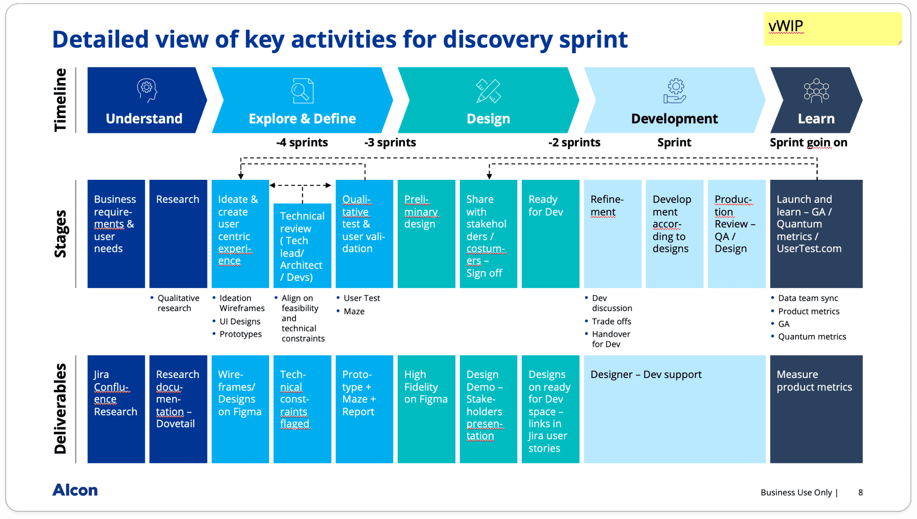
The process began with wireframes that visualized streamlined workflows, transforming insights from user research into actionable designs. Interactive prototypes in Figma brought these concepts to life, allowing surgeons and staff to provide feedback during A/B testing.Collaborating closely with engineers and product managers, I ensured the designs were technically feasible and aligned with business goals. The result was a unified, user-centered platform that simplified workflows and transformed surgery preparation processes.
The process began with wireframes that visualized streamlined workflows, transforming insights from user research into actionable designs. Interactive prototypes in Figma brought these concepts to life, allowing surgeons and staff to provide feedback during A/B testing.Collaborating closely with engineers and product managers, I ensured the designs were technically feasible and aligned with business goals. The result was a unified, user-centered platform that simplified workflows and transformed surgery preparation processes.

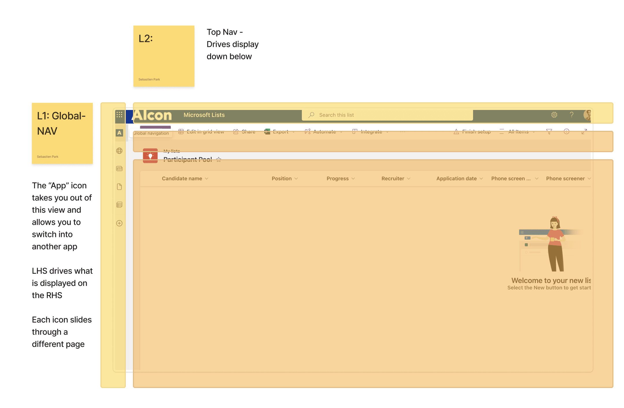
Wireframes
I developed detailed wireframes to lay out the structure and flow of the user interface. These wireframes served as a blueprint, helping to visualize the layout and functionality before moving into the design phase. By iterating on these wireframes and gathering feedback, I was able to refine the user experience and ensure that the final design would meet both user needs and project goals.
I developed detailed wireframes to lay out the structure and flow of the user interface. These wireframes served as a blueprint, helping to visualize the layout and functionality before moving into the design phase. By iterating on these wireframes and gathering feedback, I was able to refine the user experience and ensure that the final design would meet both user needs and project goals.
User Flow
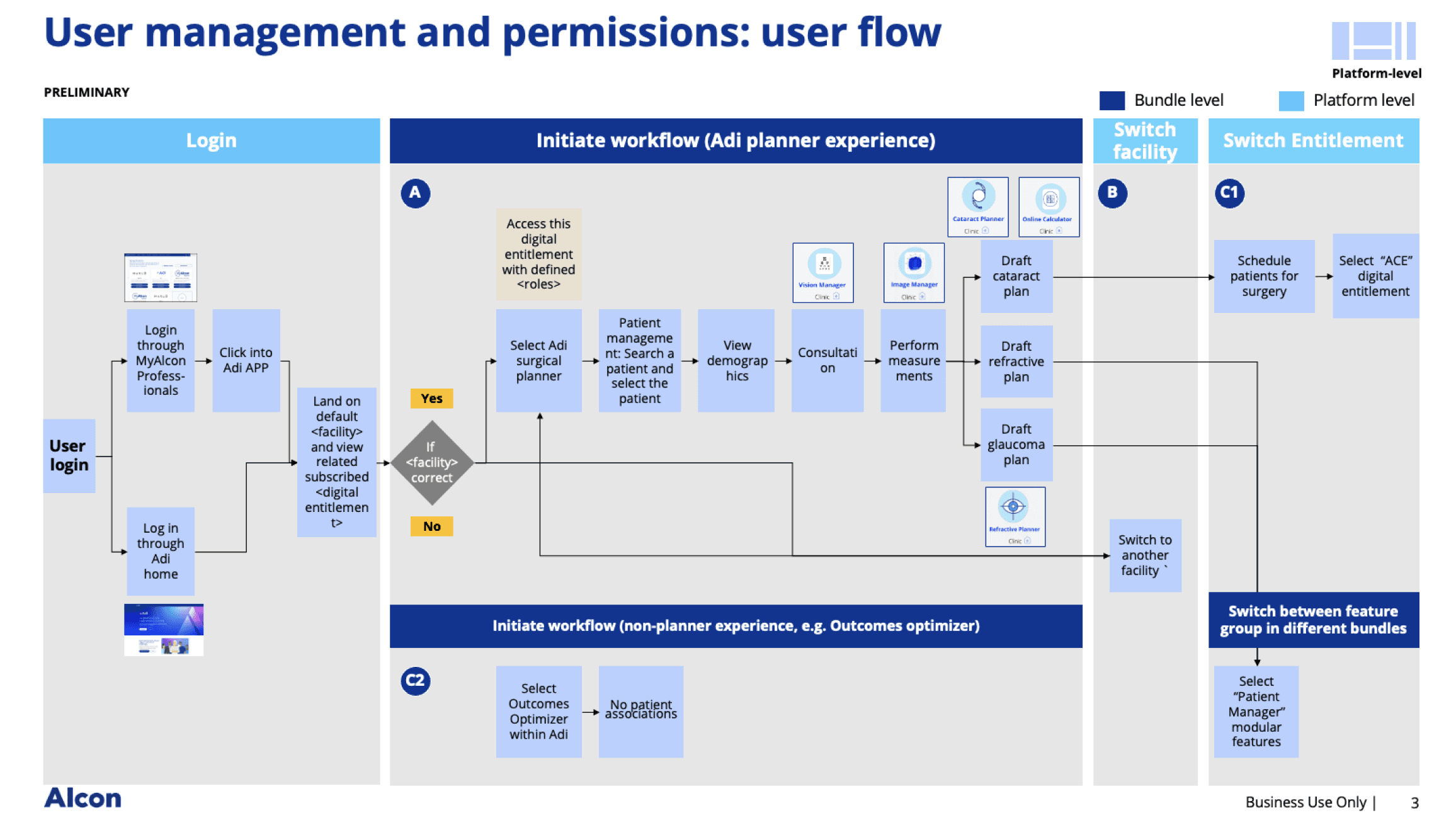
I created the user flow by mapping the key steps and interactions, ensuring alignment with business goals. Working in Figma, I designed a clear, intuitive flow to guide users through the process, from login to task completion, for both patients and clinicians.
I created the user flow by mapping the key steps and interactions, ensuring alignment with business goals. Working in Figma, I designed a clear, intuitive flow to guide users through the process, from login to task completion, for both patients and clinicians.
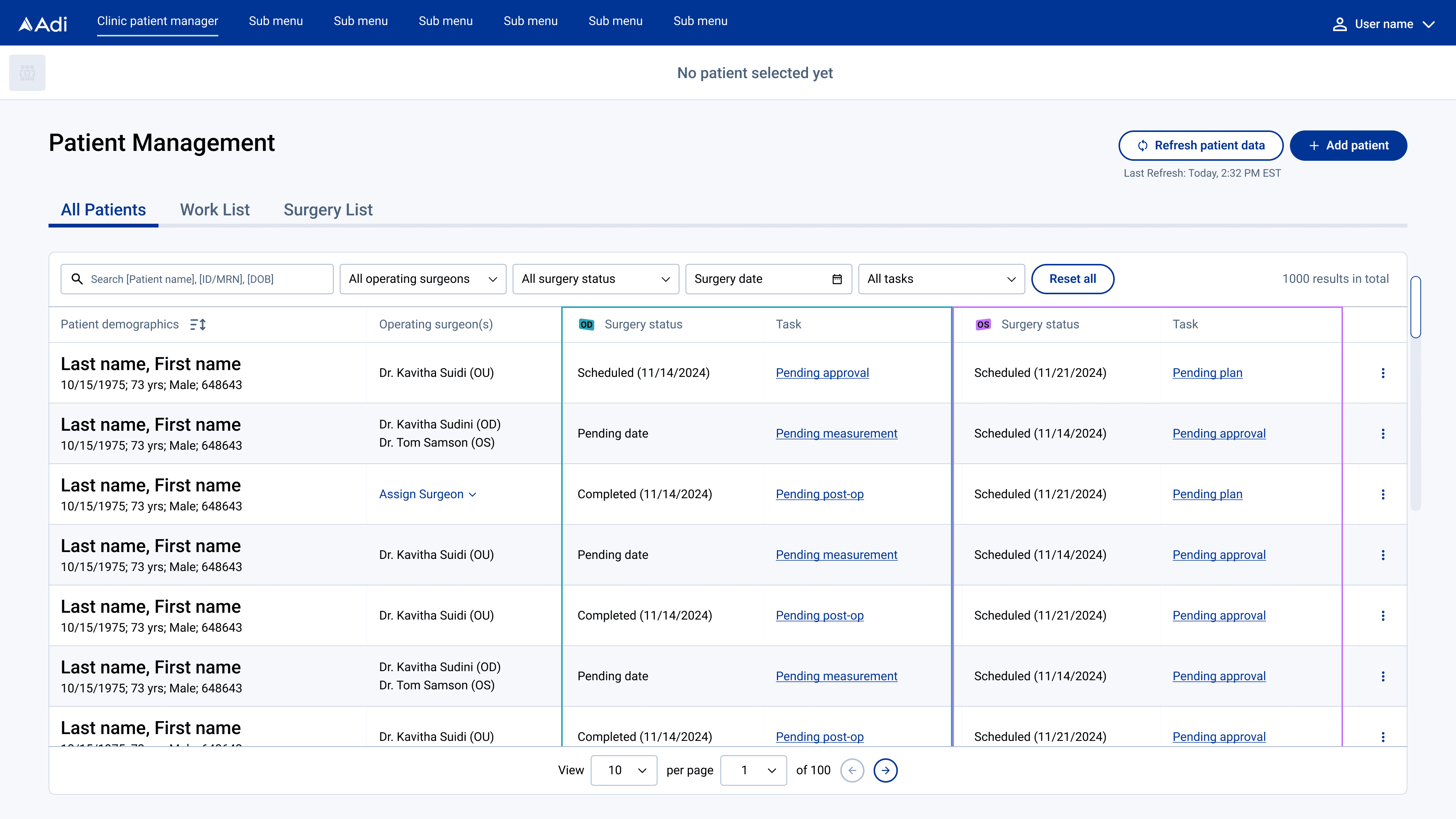
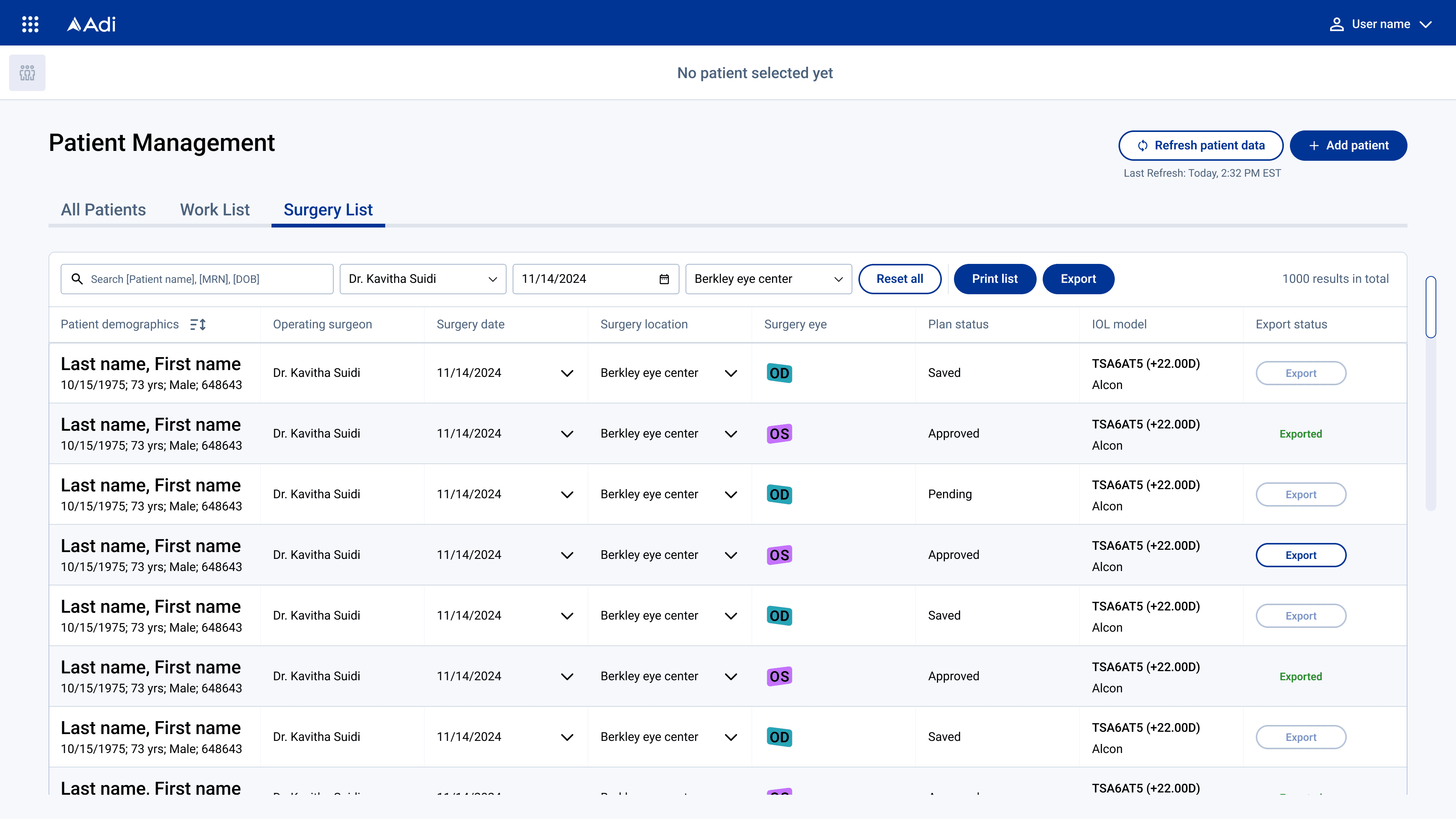
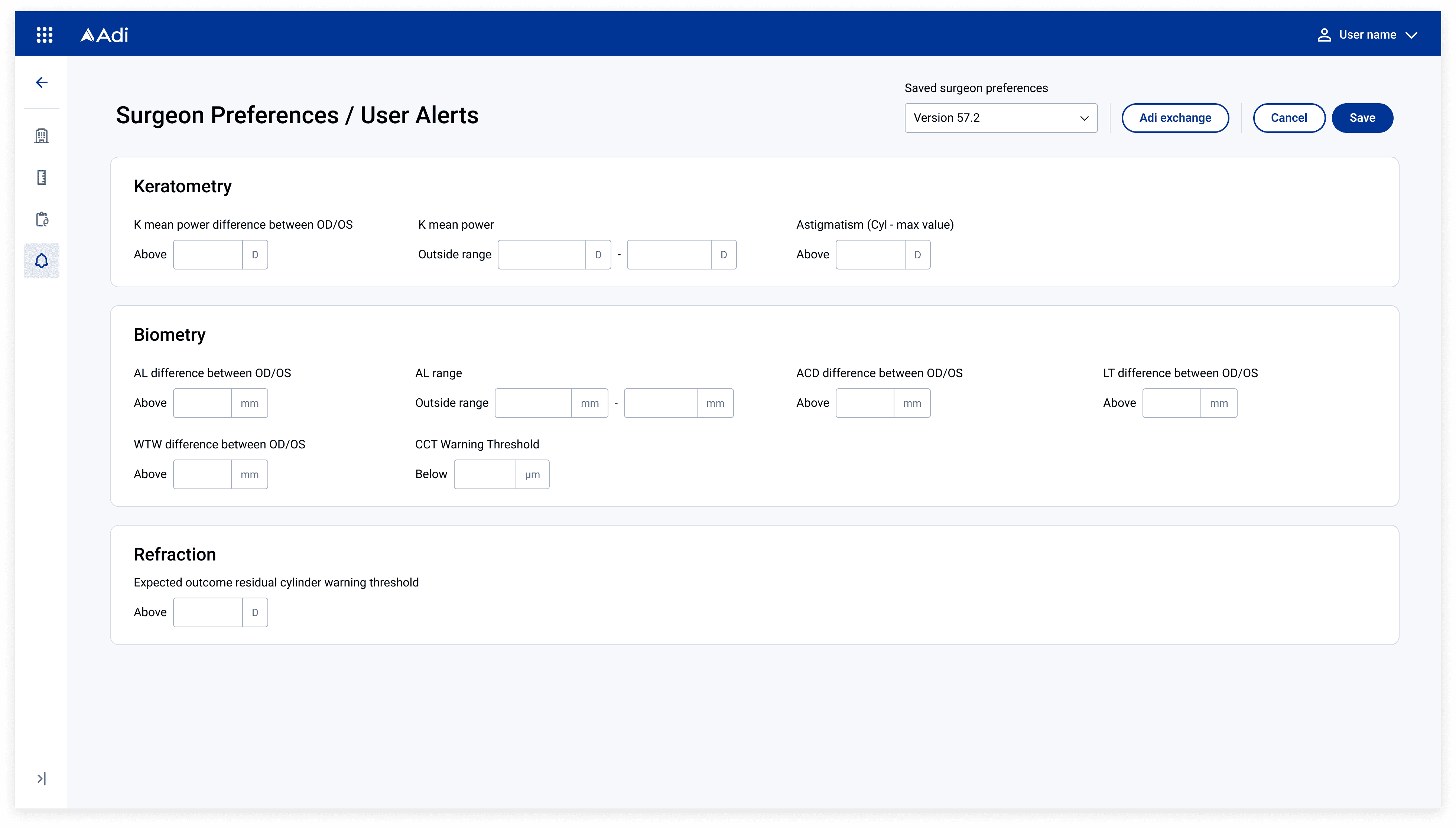
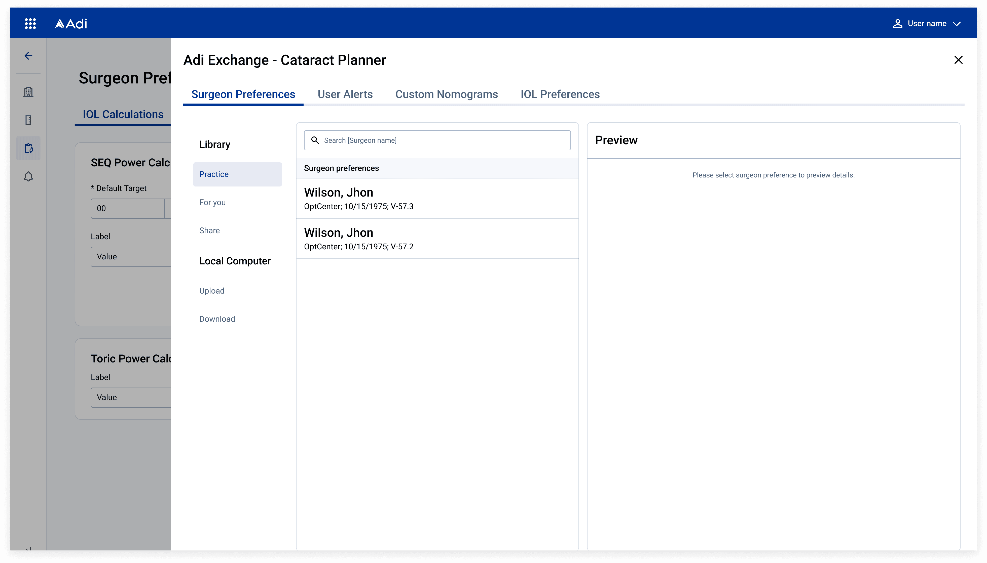
High Fidelity wireframes
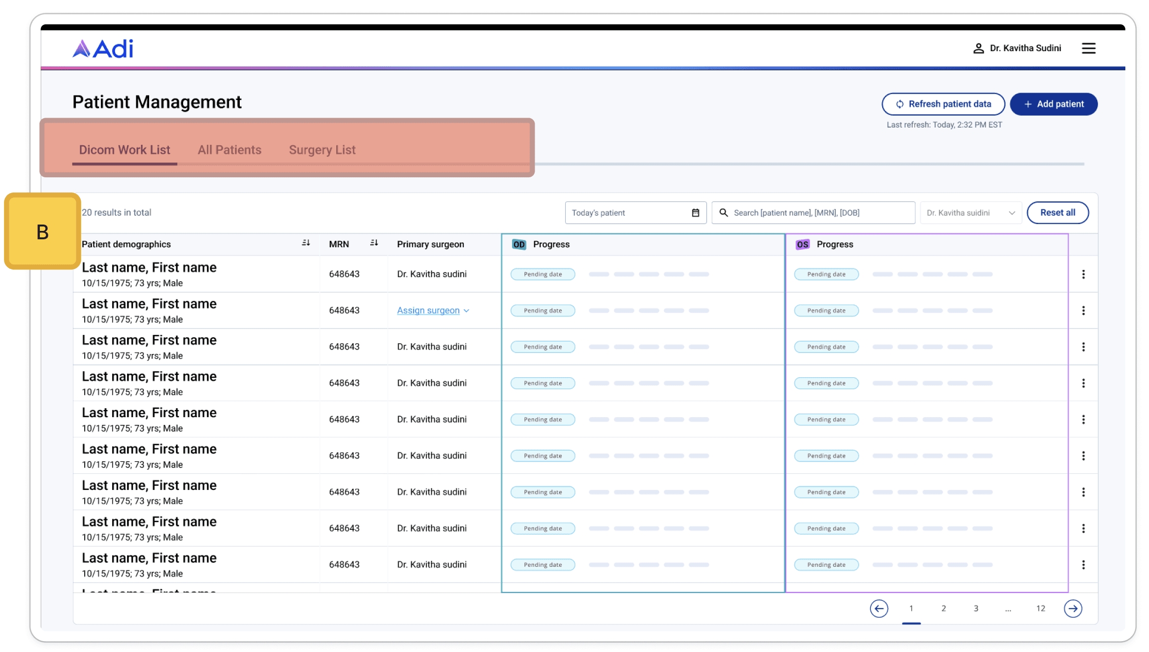
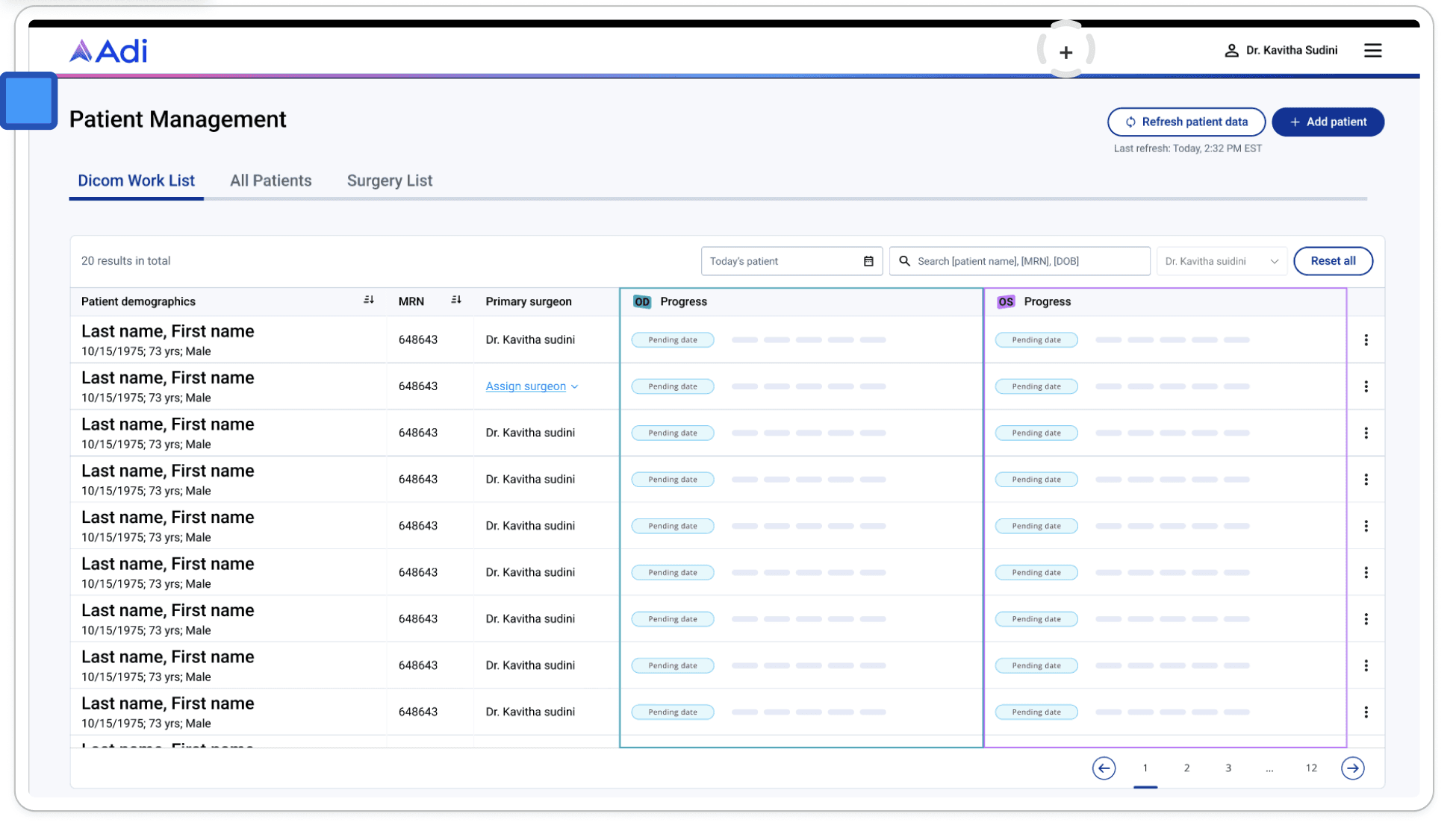
In the High Fidelity Wireframes phase, I turned the initial sketches into detailed designs that closely resembled the final product. These wireframes featured accurate visuals, color schemes, and typography, helping stakeholders and users better visualize the interface and providing a solid base for further development and testing.
In the High Fidelity Wireframes phase, I turned the initial sketches into detailed designs that closely resembled the final product. These wireframes featured accurate visuals, color schemes, and typography, helping stakeholders and users better visualize the interface and providing a solid base for further development and testing.
Prototypes
For the Prototypes phase, I spent a week developing 8 fully functional prototypes, working 8 hours a day. These prototypes simulated a real web-app experience for direct patient testing. To streamline access, I used a password system, eliminating the need for logins and making the process more seamless for users.
For the Prototypes phase, I spent a week developing 8 fully functional prototypes, working 8 hours a day. These prototypes simulated a real web-app experience for direct patient testing. To streamline access, I used a password system, eliminating the need for logins and making the process more seamless for users.
Testing: Listening and Adapting to our users needs
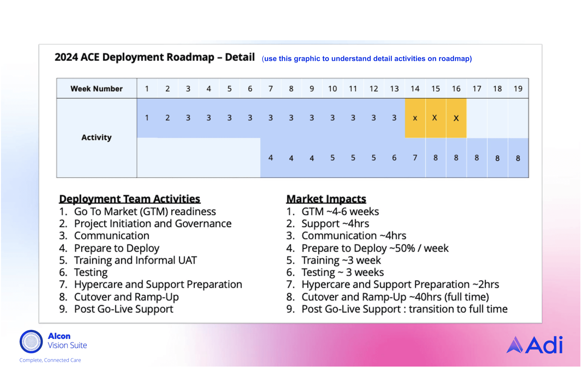
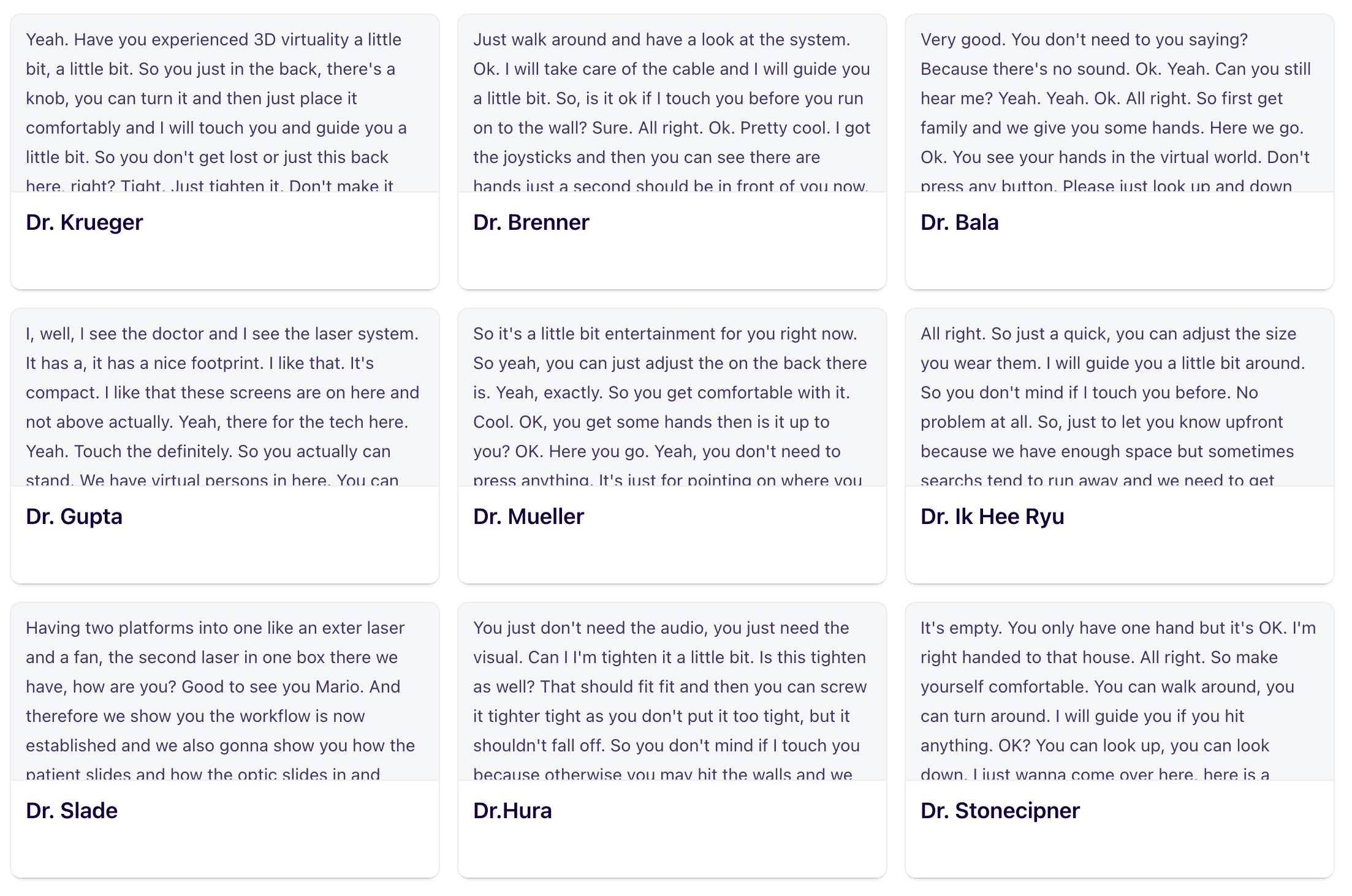
Testing AdiPlanner with real users was essential to crafting a tool that truly supported their workflows. Partnering with our Senior Digital Interface Research Manager, we set out to understand exactly how patients and surgeons interacted with the platform. Using Dovetail.com, we recorded insights from interviews, compiling detailed audio and text summaries. These insights revealed specific needs and opportunities to improve the design, giving us a clear direction for refining AdiPlanner.Turning Feedback into Action:As we reviewed feedback, certain elements stood out. One surgeon rated the industrial design a 10, commending the modern look and smooth contours—aesthetic qualities that we preserved as core aspects of the design. Another emphasized how crucial it was for the femtosecond and excimer lasers to work seamlessly together, reducing their workload and simplifying procedures. This feedback led us to focus on smooth integration and to automate processes wherever possible, ensuring surgeons could intervene only when needed.
Testing AdiPlanner with real users was essential to crafting a tool that truly supported their workflows. Partnering with our Senior Digital Interface Research Manager, we set out to understand exactly how patients and surgeons interacted with the platform. Using Dovetail.com, we recorded insights from interviews, compiling detailed audio and text summaries. These insights revealed specific needs and opportunities to improve the design, giving us a clear direction for refining AdiPlanner.Turning Feedback into Action:As we reviewed feedback, certain elements stood out. One surgeon rated the industrial design a 10, commending the modern look and smooth contours—aesthetic qualities that we preserved as core aspects of the design. Another emphasized how crucial it was for the femtosecond and excimer lasers to work seamlessly together, reducing their workload and simplifying procedures. This feedback led us to focus on smooth integration and to automate processes wherever possible, ensuring surgeons could intervene only when needed.
0:00/1:34
0:00/1:34
Solution
he final AdiPlanner design brought together everything we learned from our users, creating a tool that felt intuitive and seamless.Consistent Experience: We built a unified design system, allowing professionals to move smoothly across features without interruptions, reducing cognitive load.AI-Powered Insights: To simplify complex data, we integrated AI-driven visualizations, enabling quick access to critical patient information for informed decisions.Streamlined Workflows: Automation reduced repetitive tasks, freeing up time for healthcare providers to focus on patient care.Clean,Modern Interface: The design’s modern aesthetics and smooth navigation were well-received, making AdiPlanner both efficient and enjoyable to use.AdiPlanner became a trusted tool for healthcare professionals, built to enhance both efficiency and user satisfaction.
he final AdiPlanner design brought together everything we learned from our users, creating a tool that felt intuitive and seamless.Consistent Experience: We built a unified design system, allowing professionals to move smoothly across features without interruptions, reducing cognitive load.AI-Powered Insights: To simplify complex data, we integrated AI-driven visualizations, enabling quick access to critical patient information for informed decisions.Streamlined Workflows: Automation reduced repetitive tasks, freeing up time for healthcare providers to focus on patient care.Clean,Modern Interface: The design’s modern aesthetics and smooth navigation were well-received, making AdiPlanner both efficient and enjoyable to use.AdiPlanner became a trusted tool for healthcare professionals, built to enhance both efficiency and user satisfaction.
Final Solution
🏁 The Impact of AdiPlanner AdiPlanner successfully transformed the daily workflow of healthcare professionals, shifting their focus from administrative friction back to patient care.
🧩 Unified Design System Reduced cognitive load by creating a cohesive and familiar interface across all tools. Impact: +20% task completion speed and +30% user satisfaction.
🧠 AI-Driven Data Visualizations Enabled providers to access and interpret complex, critical patient insights at a glance. Impact: +35% decision-making efficiency.
⚡️ Automated & Streamlined Workflows Minimized repetitive tasks and workflow interruptions, specifically empowering surgeons to stay focused during procedures. Impact: -15% administrative workload.
✨ Modern, User-Centric Interface Introduced a clean, responsive layout with intuitive navigation that users seamlessly integrated into their daily routines. Impact: +40% increase in reported ease of use.
Reflection
What I learned designing for electrification
What I learned designing for electrification
Designing for construction workers, site managers, and fleet operators pushed me to think beyond pixel-perfect aesthetics. The real challenge was making complex energy data actionable in dusty, noisy, high-stakes environments — and proving that enterprise products deserve the same design rigor as consumer apps.
Designing for construction workers, site managers, and fleet operators pushed me to think beyond pixel-perfect aesthetics. The real challenge was making complex energy data actionable in dusty, noisy, high-stakes environments — and proving that enterprise products deserve the same design rigor as consumer apps.
Next Project